Case study · Design engineering
Queen's Dilemma
An ornate, art-heavy web app that holds up at every screen width and text size. I designed and built it so six friends could hand out a board game's characters fairly, and now any group can.
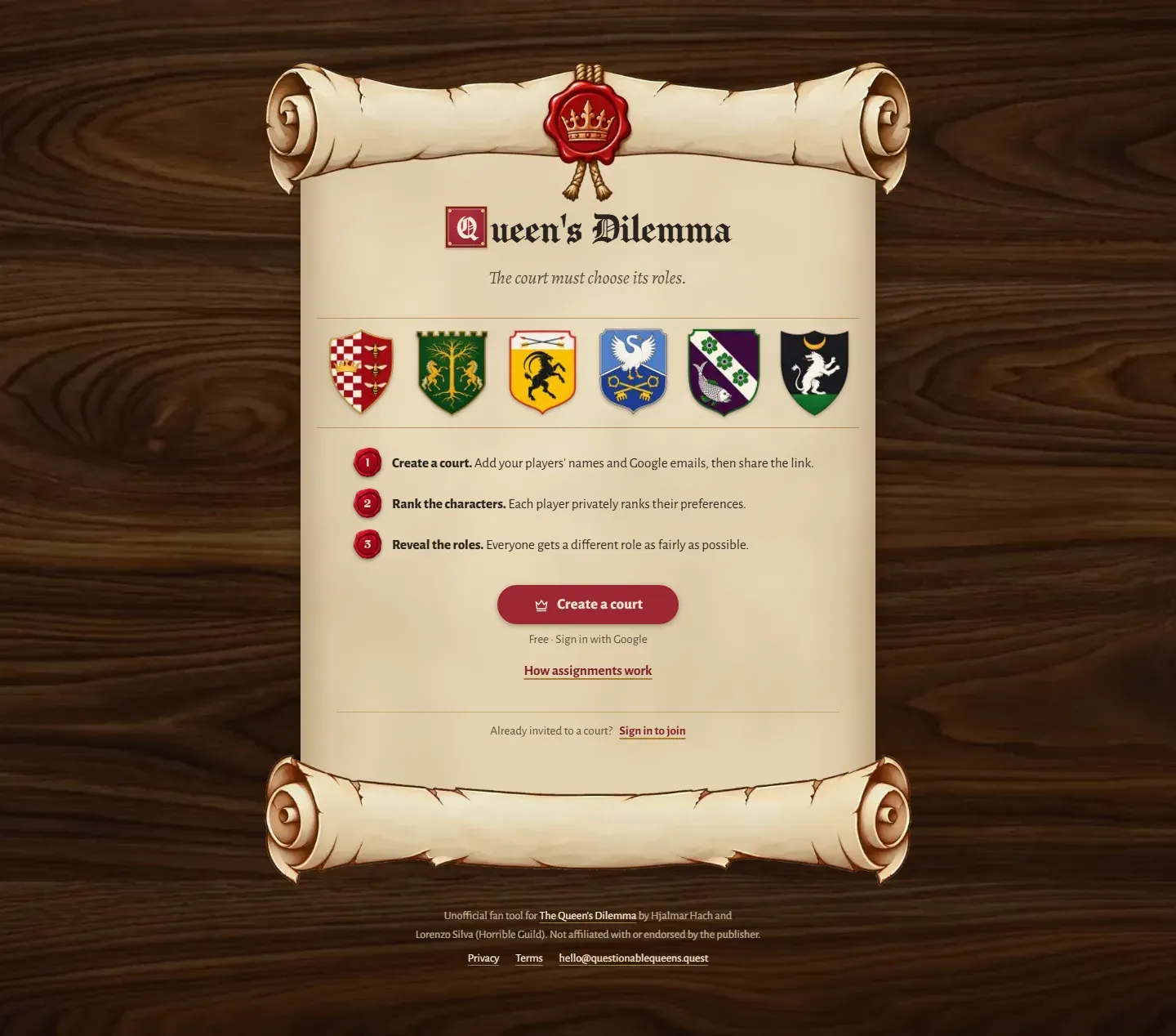
- Role
- Solo: product, interaction and visual design, frontend and backend
- Timeline
- October 15, 2026 to present
- Status
- Live and open to any group of 3 to 6. Its first game was six friends' game night.
- Built with
- Next.js, React, TypeScript, Tailwind container queries, Convex, Clerk, dnd-kit
What this case study shows
- Responsive by component
- Container queries instead of screen breakpoints. At 640px the biography went from an 81px to a 318px column, no name splits mid-word, and 200% text gets a deliberate layout. A script sweep verified it.
- A theme turned into a system
- Every text colour pairing has its contrast recorded, and the game's wax seal marks every commitment, from sealing a ranking to breaking it open for your role.
- Motion with a job
- A loader that becomes the page instead of vanishing, and a reveal you break open yourself. Each has a reduced-motion path that keeps the moment.
- Private tool to public product
- A fairness rule anyone can check, then a one-night tool rebuilt for strangers, with tests going from 78 to 335.
Fair, and impossible to rig
My friends and I were about to play The Queen's Dilemma, where everyone plays a different character. We needed to hand out the six characters without anyone choosing first, and we weren't going to be in the same room. So everyone ranks the characters on their own phone, whenever suits them, and seals the ranking. The last seal assigns every role at once.
Taking turns rewards whoever goes first. Picking the lowest total ranking sounds fairer, but it will happily give one person their last choice as long as everyone else does well. So the server checks all 720 possible assignments and looks after the unhappiest player first, then the next, and so on.
Option A Chosen
- 6
- 2
- 1
- 1
- 1
- 1
Total 12
Option B Chosen
- 3
- 2
- 2
- 2
- 2
- 2
Total 13
By total, A wins, and someone gets their 6th, last choice.
Worst first, B wins. Its total is higher, but nobody does worse than their 3rd choice.
Nobody can rig it, including me
I was one of the six players, so cheating had to be impossible for the person running it. There's no button to press: the last ranking to arrive runs the assignment in the same transaction. Ties are broken by a seed whose hash is saved before anyone ranks, and no query returns anyone else's ranking. Tests prove each of these.
What happened on the night
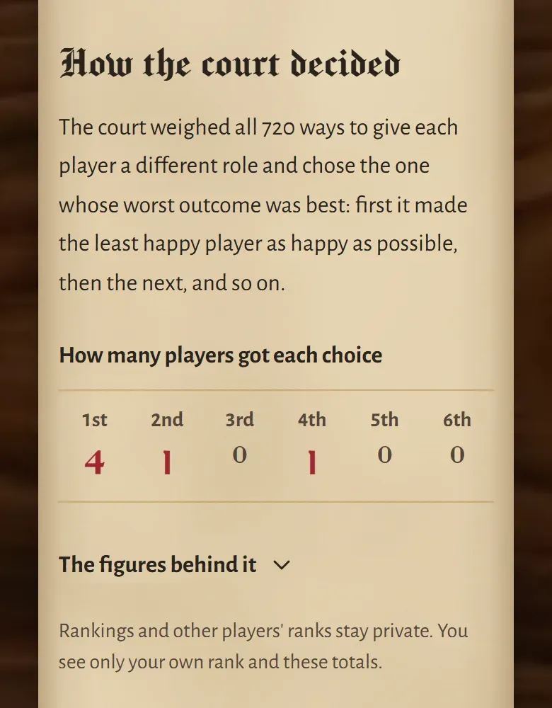
Four of us got our first choice, one their second and one their fourth. Two outcomes were equally fair, so the sealed seed chose between them. One friend was a little disappointed with their fourth. Because the rule protects the worst outcome first, that means no arrangement could have given everyone their third choice or better.
I first showed the seed and its hash on the result, then took them off: accurate, but too technical for a group of friends. The result now explains the rule in one sentence.
One card at every width
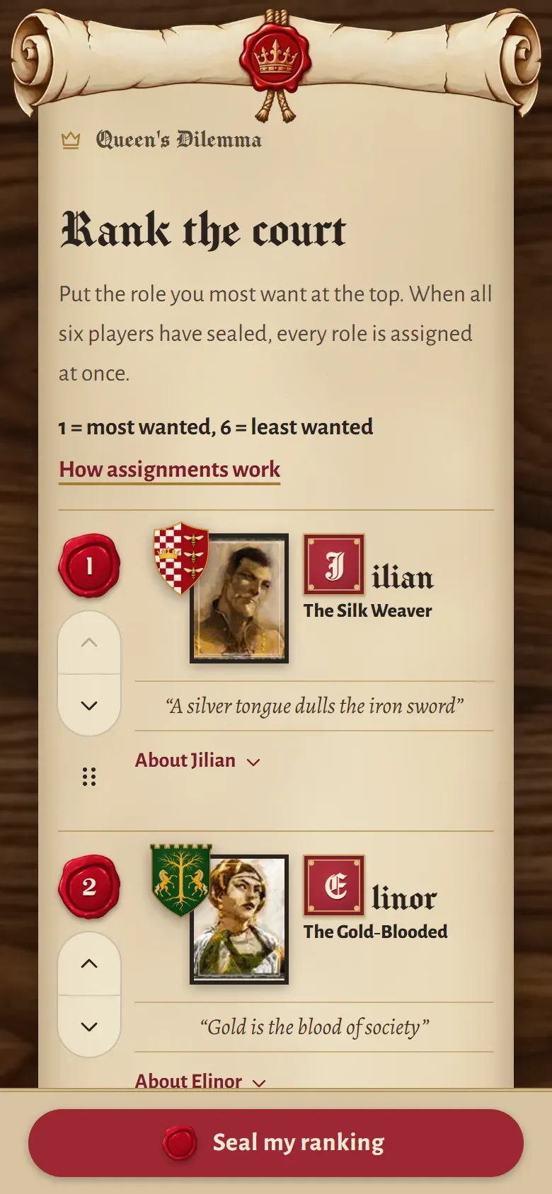
This is where I spent the most time. The ranking card is the heart of the app, and I made it work everywhere in a day of small changes, each checked by measurement.
A card holds a lot: the rank seal, the crest over the portrait, a drop-cap name and title, a quote, a biography, and three controls (drag, Up and Down). Its layout comes from the game's character scroll, which is a desktop composition. On narrower screens it broke names in half. At tablet widths it crushed the biography into an 81px column. At 200% text it pushed the name off the screen.
Before
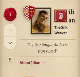
The name splits into “ili” and “an” beside the art, and the title wraps.
Now
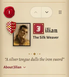
The controls move onto the seal's line, so the art and name get the full width. The name is whole.
Before
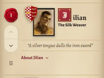
Fine at this width, with the controls in a rail down the left.
Now
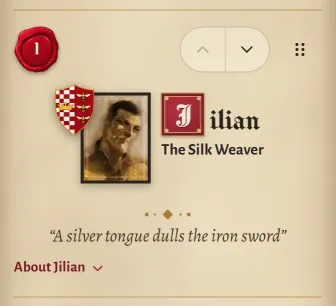
The same arrangement as on narrower phones, so phones share one layout, and the quote gets the full width.
Before
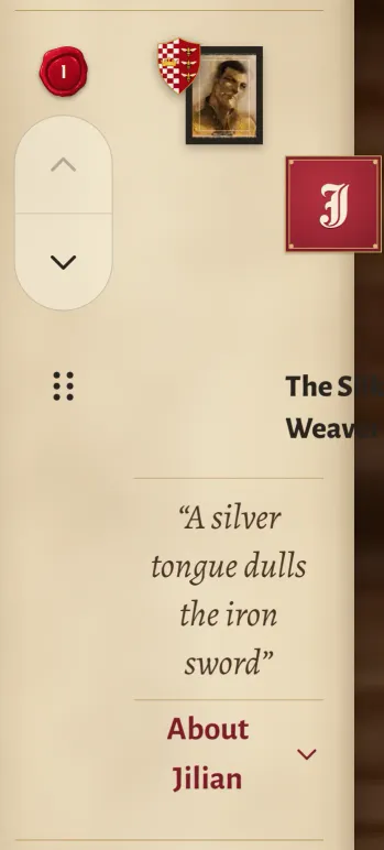
The rail and the text double but the art doesn't, so the name is pushed off the screen entirely.
Now
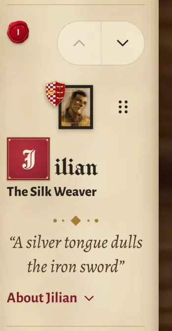
The card reads its own width, so large text gets the same layout as a narrow phone. Nothing got smaller.
Before
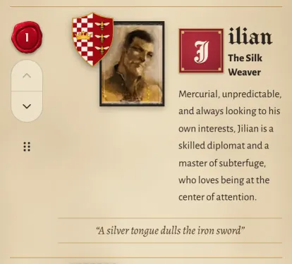
The desktop layout switched on at a 640px screen, but the card had only 386px. The biography is crushed beside the portrait.
Now
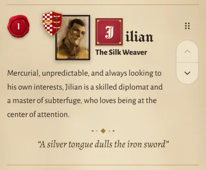
A tablet layout: art beside the name, biography across the card beneath.
Before
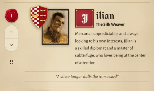
Still the desktop layout in too little room.
Now
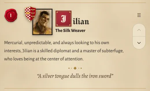
The tablet layout, with the biography and quote sharing one measure.
Before
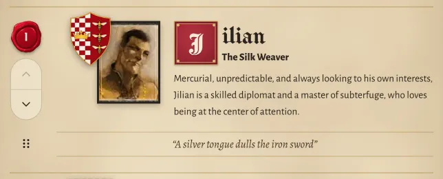
Desktop, where the original composition worked.
Now
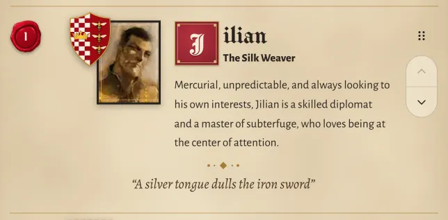
The desktop composition is kept. The controls moved right, and the type and quote were refined later.
The same card from the build just before this work and from today's app, cropped to the card at each screen width. On a wide screen they're shown at actual size.
Why breakpoints couldn't fix it
The desktop layout switched on at a 640px screen, but at that width the card's content column was only 250 to 400px. Large text made it worse: the controls are sized in rem, so they double at 200% text, but the art is sized in pixels, so it doesn't. No rule based on the screen could know how much room the name actually had.
Let the card read its own width
I made the card and its content column into two named containers, and every layout decision reads the width it actually has. That turns large text into the same problem as a narrow phone, with the same deliberate answer. My rules were: nothing shrinks, names never break, and the desktop composition stays.
I also moved the controls. The first card kept Up, Down and the drag grip in a rail on the left, under the rank. Most people hold a phone in their right hand, so they now sit in a column on the right, under the thumb. Up and Down also scroll the page by exactly as far as the card moved, so the button you pressed stays where it was: six taps in one spot take a character from 6th to 1st.
<article className="@container/entry">
  <div className="grid
    [grid-template-areas:'seal_ctl'_'body_body'_'more_more']
    @min-[max(190px+2.75rem,46px+9.5rem)]/entry:[grid-template-areas:'seal_body_ctl'_'seal_more_ctl']">
    …
    <div className="@container/content [grid-area:body]">
      <div className="grid [grid-template-areas:'art'_'name']
        @min-[15rem]/content:[grid-template-areas:'art_name']
@min-[28.5rem]/content:[grid-template-areas:'art_name'_'art_desc']">CharacterCard. Thresholds mix
pixels and rem, like max(190px + 2.75rem, 46px + 9.5rem): the pixel part is the art and seal, the rem part is the text and
controls. So a threshold moves with text size by exactly as much as
the parts that grow.
| Room | Controls | Art and name | Biography and quote |
|---|---|---|---|
| Under ~305px, or large text | Seal and Up/Down on one line; the grip laid over the card's edge | Portrait centred above the name | Quote across the card |
| ~305 to 420px | Up, Down and grip on the seal's line | Art and name side by side, centred as one group | Quote across the card |
| ~424 to 640px | A column on the right, under the thumb | Side by side | Quote across the card |
| ~640 to 916px | Column on the right | Phone-size portrait beside the name | Biography and quote across the card, one 52ch measure |
| ~916px and up | Column on the right | The scroll's own composition: large portrait, drop cap spanning name and title | Biography beside the portrait |
- Biography column at 640px
- 81 → 318px
- Tallest card at 640px
- 831 → 289px
- Names split mid-word
- 6 → 0
Measured, not eyeballed
I tested the layout with measurements instead of three breakpoints. Short headless Chrome scripts rendered the real ranking screen and checked:
- Names: every name renders on one line, at 320, 375, 390 and 430px, at 100% and 200% text.
- Collisions: every 4 to 8px from 232 to 1000px, at five text sizes, no crest, portrait, name or quote overlaps the seal or the controls.
- Controls and measure: every control stays inside its card and at least 40px, and lines are counted in rendered characters, with edges measured from the letters, not the boxes.
The sweep caught what my eyes missed. In one 32px band the crest hung over the rank seal, and at one 4px step the laid-over grip covered the name. Looking caught what the numbers missed, like a control squeezed until it clipped.
Saying no with data
Some ideas, including some of mine, were built and measured and then dropped:
- Switching to desktop sooner. Lines would drop to about 32 characters, under the range I'd set.
- Centring the text block in the spare space. It trimmed the right-hand gap, but the text then lined up with nothing: neither the seal nor the crest.
- Centring the controls in the spare space. It measured perfectly, and side by side it looked worse.
A theme with rules
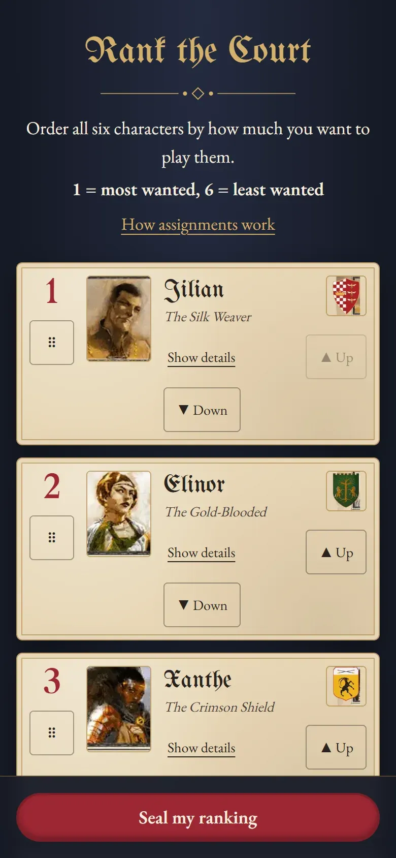
My first version used the game's art but not its layout: gold blackletter on a navy background, with parchment cards floating on top. The character names were hard to read, and the cards ignored how the game's own character scroll is laid out.
The next day I rebuilt every screen on that scroll. Parchment became the page, the crest moved over the portrait, a wax seal took the rank, and the name got a drop cap. I chose a display face that keeps the blackletter mood but reads, and supplied the scroll, seal and table art myself instead of generating any.
Day 1
Day 2
One seal for every commitment
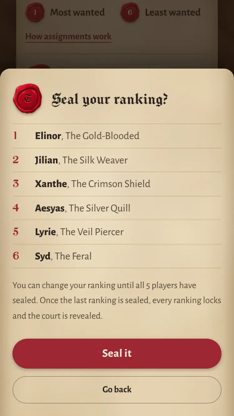
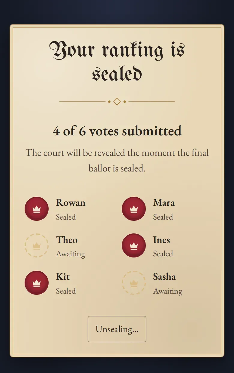
A theme like this falls apart quickly if every screen improvises, so I gave the game's wax seal one job: it marks commitment. You press it to seal your ranking, watch your friends' seals appear as they seal theirs, break yours to change your mind, and break it once more to read your role. Wax red follows the same rule. It fills only the seals and the one button on each screen that commits something.
-
Rank
Raised numerals in the game's typeface give each character its place. Sized in rem, they grow with the text.
-
Sealed
A player's initial, sunk into the wax like their own stamp, once their ranking is sealed.
-
Not sealed yet
The outline of a seal around an empty crown. It's drawn rather than faked in wax, and never lettered, so it can't pass for sealed.
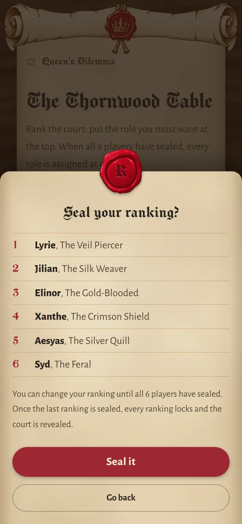
A seal big enough to read
The confirmation for sealing first had a small seal beside its title: safe, but the initial was too faint to read. I hung it from the sheet's top edge instead, half outside, the way wax closes a letter. A much larger seal cost only about 10px of height. The sheet scrolls on small phones, and a scrolling box clips anything hanging outside it, so I split the dialog into two layers: one that holds the seal, and a sheet inside it that scrolls.
First try
Now
One tap shouldn't stall six people
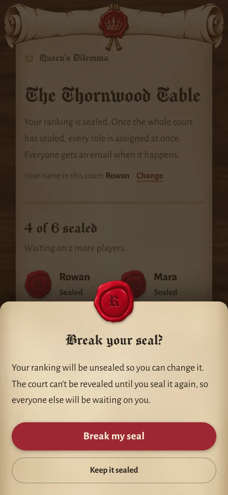
Changing your ranking deletes your sealed one, so nothing private lingers. It also means one stray tap holds up the reveal for everyone. The first version unsealed instantly. Now breaking your seal asks first, says what it costs everyone else, and starts on “Keep it sealed”. The waiting room shows your sealed order, so nobody breaks a seal just to check.
Day 1
Now
Tokens with the contrast written down
The rules live in a design document I keep in step with the code. Every colour pairing used for text has its contrast recorded. Old gilt doesn't have enough contrast on parchment to be text, so instead of a ratio it gets a rule: rules and frames only.
- Parchment
#ecdfc3The page itself - Iron-gall ink
#29231eText, 12:1 on parchment - Faded ink
#55473aSecondary text, 6.3:1 - Wax red
#9d2734Commitment: seals, the Seal button - Old gilt
#a47c36Rules and frames only, never text - Walnut
#241912The table under the scroll
Motion with a job
The app has very little motion, and each piece is there to orient or to confirm. That restraint is what lets the few moments land.
A loader that becomes the page
The first loader was a breathing wax seal and “Summoning the court…”, and it felt flat. Now a scroll unrolls under an illuminated “Loading…” with a short tale from the court, then rolls back up and goes again. When the page is ready, the scroll doesn't vanish. The page unrolls on from wherever the scroll had got to, while the loader's words fade where they stood. A skeleton screen was never an option: the loader shows before the app knows which screen comes next.
- Never a blink. A load under 250ms shows no loader at all. Once it appears, it stays at least 700ms, so it never flashes for a moment and vanishes.
- Roll and paper never part. My first version revealed the sheet with a clip on the main thread while the roll moved on the compositor, and under load they drifted apart. Now the window lifts with the roll while the sheet drops by the same amount: all transforms.
- Quiet for everyone else. Screen readers hear only “Loading…”. With reduced motion, the scroll rests open with its tale.
The reveal you break open
Voting ran over a few days, so most players met their result alone, on a phone, after an email. The first version played its animation as the page loaded, before anyone was looking. Now the player presses the seal, and it cracks where they pressed it.
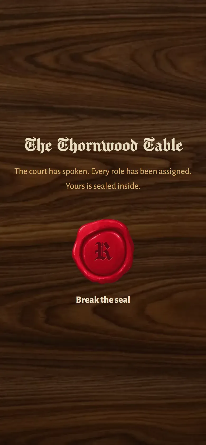
You press it
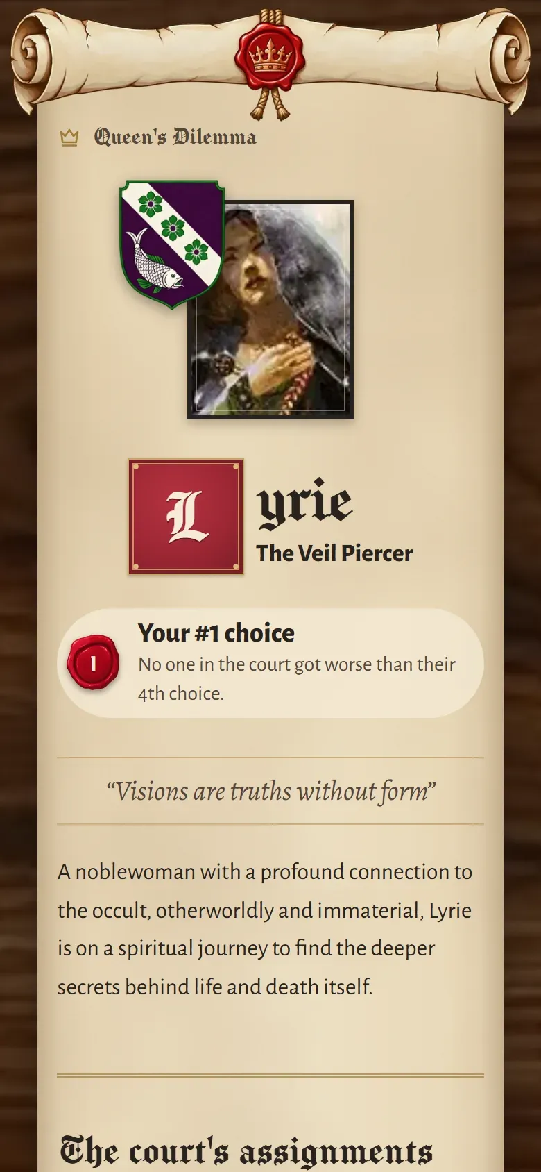
Your role unrolls
- No empty frame. The portrait, crest and scroll load while the letter is still sealed, at the exact sizes the reveal asks for. On a throttled connection, all three arrived before the press.
- Reduced motion keeps the moment. Breaking the seal is a press, not an animation, so it stays. Only the motion goes.
- Focus follows the change. If the reveal arrives while you're in the waiting room, focus moves to the new heading, so a screen reader isn't left on a button that no longer exists.
Opening it to strangers
The first version was built for one evening: one court, six friends in a config file, fixes from the command line. That was the right call for a one-time event. Opening it to any group of 3 to 6 meant undoing almost every shortcut.
-
Keep the friends' court exactly as it was
Their game was already decided. I moved it into the new multi-court model in place, and a test checks that every row except two new fields is identical, so nobody had to rank again and their result still replays.
-
Invite by link, not by email
A public site that emails anyone you name is a spam relay. Hosts get a link and a ready-to-paste message instead. The only email the site sends goes to people who have already signed in.
-
Removing a player never reveals the court
When a court stalls, the host can remove someone, but that mustn't trigger the reveal as a side effect. Removal is undoable, the host is nudged first, and the reveal becomes a deliberate button. The host controls when, never what.
-
Make the privacy page true, then keep it true
The code deleted courts after 30 days, but the email service kept every recipient's address. A daily cleanup made the promise true end to end, and the page reads its numbers from the same constants as the deletion job.
I shipped it in seven phases, each written test-first and checked by an independent review. Accessibility audits ran alongside: axe-core on every public page, reflow at 320px, enlarged text spacing, keyboard focus and Windows high-contrast mode, reaching out to the 404 page and link previews in group chats.
- Automated tests
- 78 → 335
- Players per court
- 6 → 3 to 6
Working with AI
I built this with Claude Code, using skill-based workflows for planning, implementation, design review and code review. I wrote the build spec myself: the fairness rule with a worked example, the privacy model, the reveal's rules and the acceptance criteria. Most of my time went into design decisions and reviewing what came back.
- Side by side, then my call. I had alternatives built next to each other and turned down the ones that didn't work, including three replacement fonts for the drop caps.
- Reviews get checked too. When a design review misread how the reveal works, I pushed back, checked it against the backend code, and dropped half of its suggested fix.
The pattern I noticed most: the first build of a request tended to come out safe, optimized for every constraint. A short “what if” from me, like bigger and in a better place, pushed it to the expressive version, and then I made that version meet the same constraints.
What I learned
Text size is a layout input, not a zoom level. Once the card read its own width, a phone with large text and a narrow phone became the same problem with the same answer, and I stopped designing for screens and started designing for the room a component actually gets.
Measuring a layout finds different bugs from looking at it. The scripts caught collisions in bands I'd never have stopped at by hand, and screenshots caught problems no metric was checking. I needed both.
A theme only holds up when it has rules. The seal works because it means the same thing everywhere, and because I left it out of the places it didn't belong.
Try it
It's live at questionablequeens.quest. We're still playing, so it keeps growing with our games, starting with session notes for each game night.
Interested in this work? Email me at ilya.m.polyakov@gmail.com or go back to the home page.
Queen's Dilemma is an unofficial fan tool for The Queen's Dilemma by Hjalmar Hach and Lorenzo Silva (Horrible Guild), and isn't affiliated with or endorsed by the publisher. Character art and text come from the game's character scroll. Screenshots show a test court with invented players.